Red Earth approached us to redesign their packaging for their China market after they did their research they realised there were 2 main problems:
1. Their target wanted something softer and more romantic.
2. Their main brown colour was not consistent throughout.
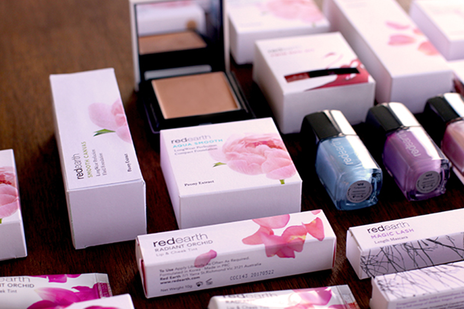
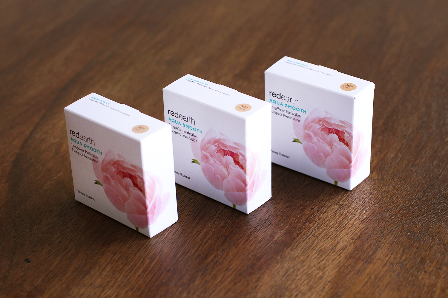
We did an audit and went through all their products and picked a consistent unique brown that they used throughout. We suggested to use simple soft photography to convey the romantic mood of the packaging.
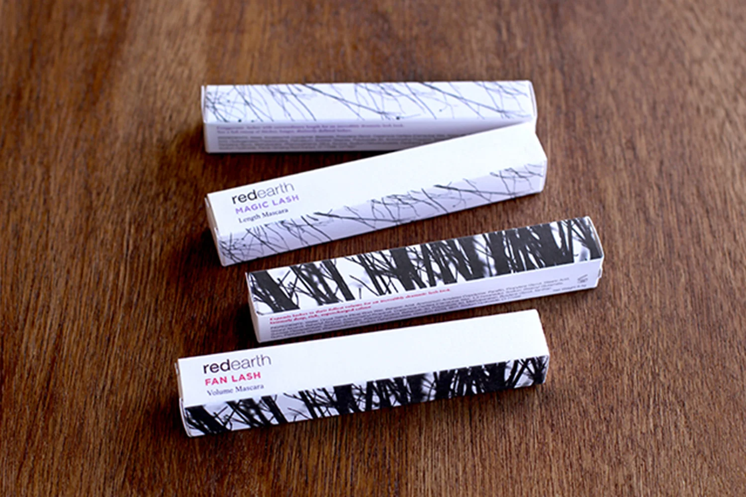
Mascara – Lengthen vs volume which is represented by the image of tree branches.
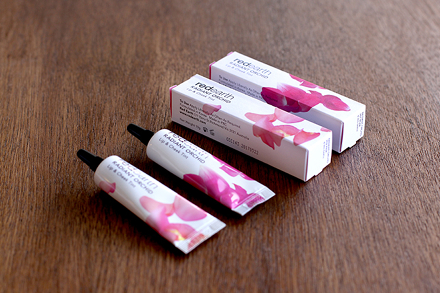
Radiant Orchard collection - Lip and cheek tints and an eye shadow palette, which is represented by petals of flowers. Compact / Concealer - which is represented by softness of peony.
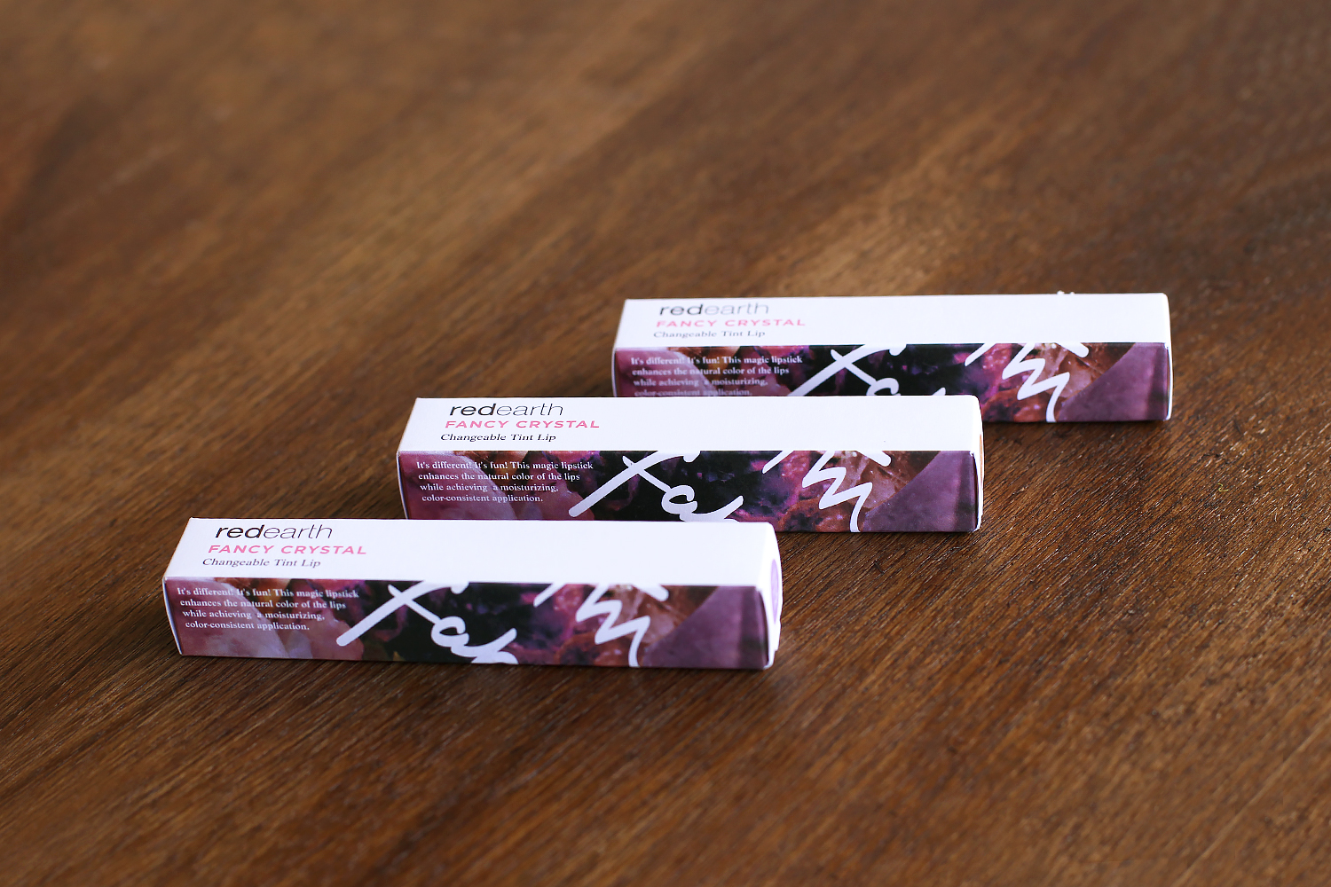
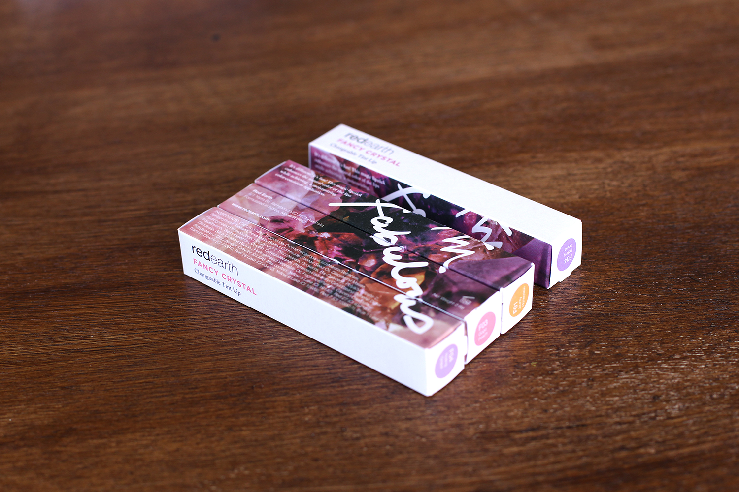
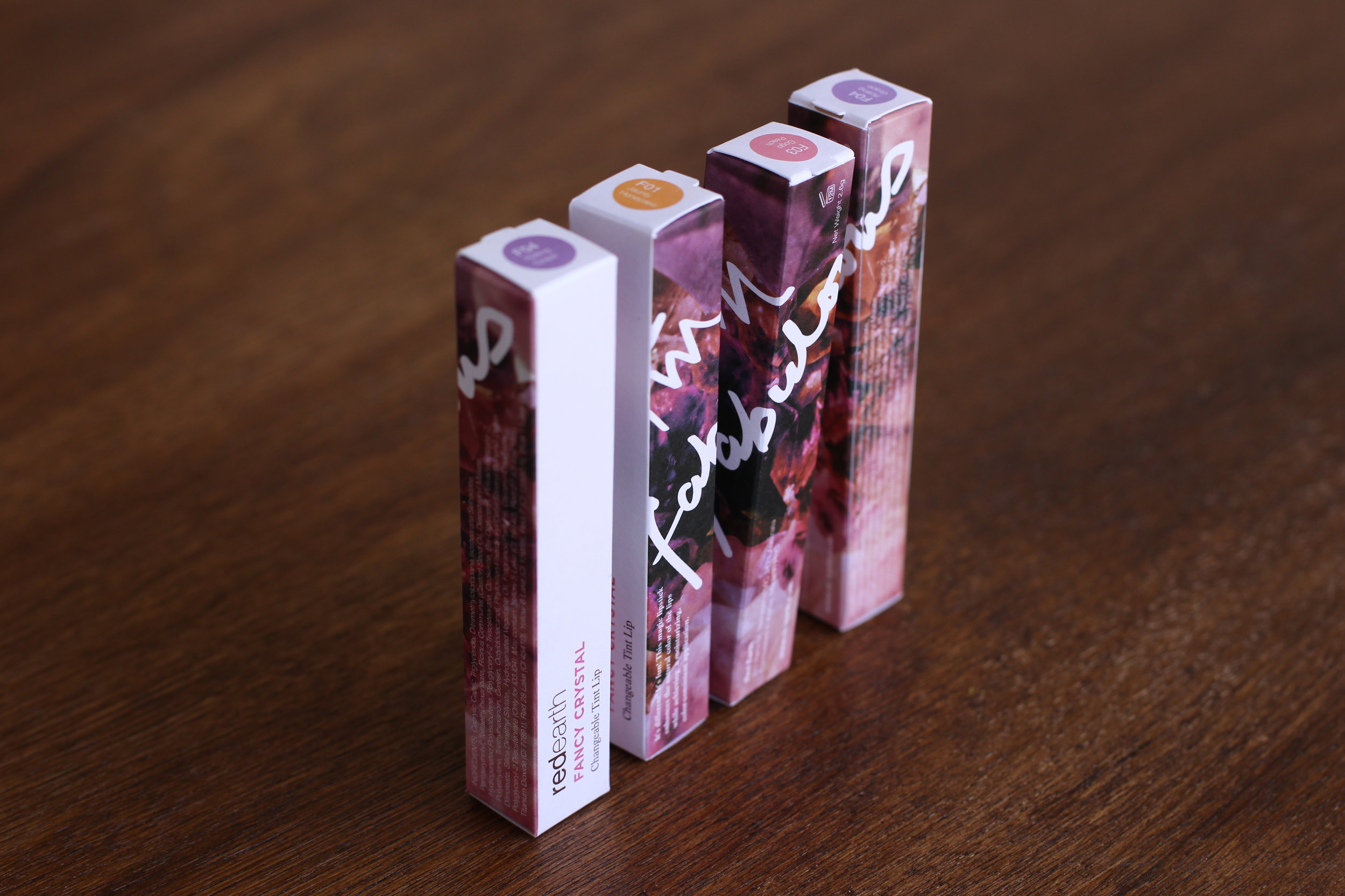
There were a few products Red Earth wanted a more young audience so we did a series of flowers but a more rock & graffiti feel. (Such as the lip pen)
PACKAGING - china market
RED EARTH