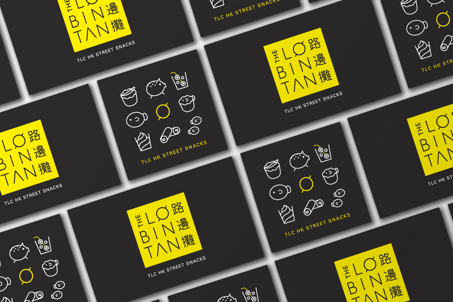
corporate identity, packaging, photography
the lobintan
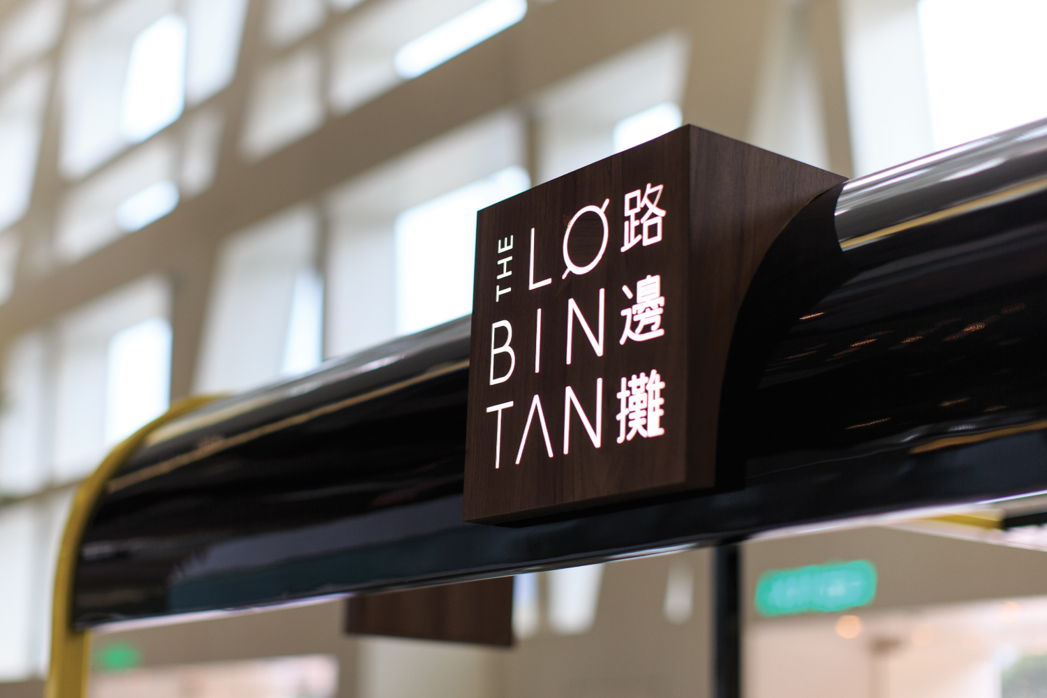
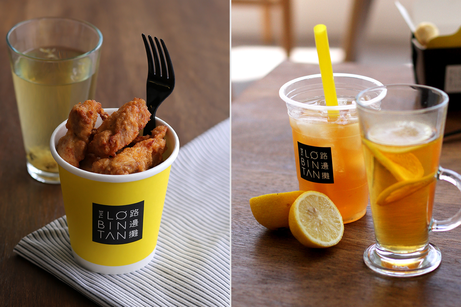
The Lobintan is a modernized Hong Kong Street Food that you normally see at the corner of a busy streets. The particular store is located at Festival Walk and placed in their playful food truck!!
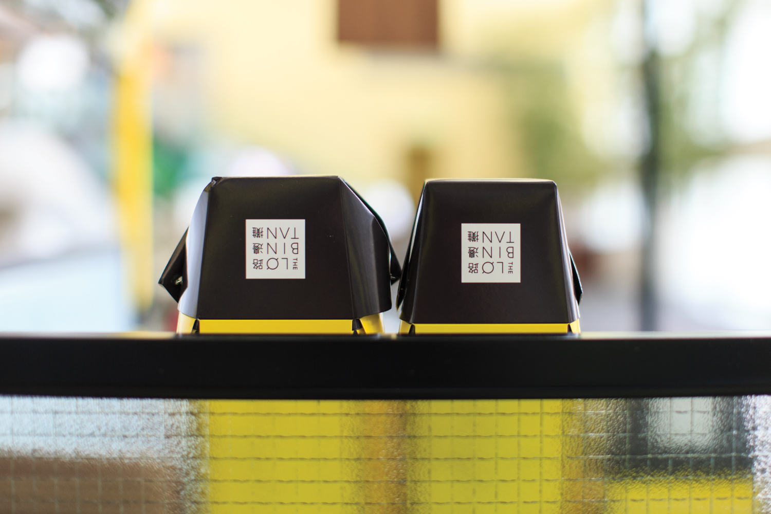
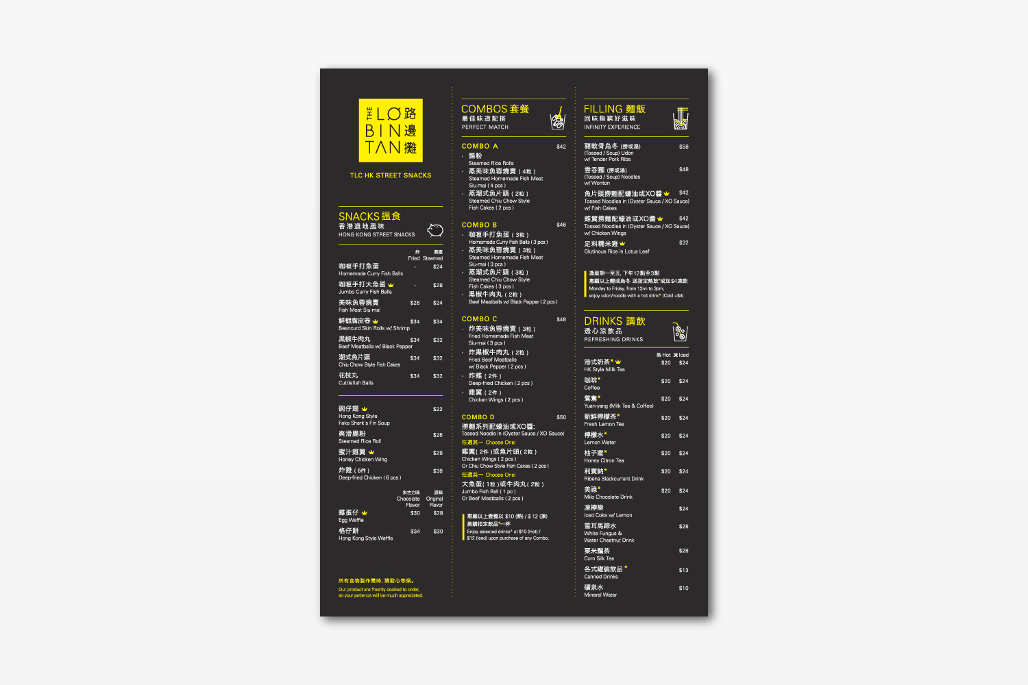
The English name plays the Chinese pronunciation of the Chinese words”Street side store”. Which has a nice catch to it. The brand main objective was to modernized the idea of Hong Kong street food. So we used a modern serif type and keeping everything simple and clean. The boxes we used Chinese takeaway boxes to play on the idea of a Chinese restaurant in non Asian country.