corporate identity, print, SIGNAGE
AVELINE
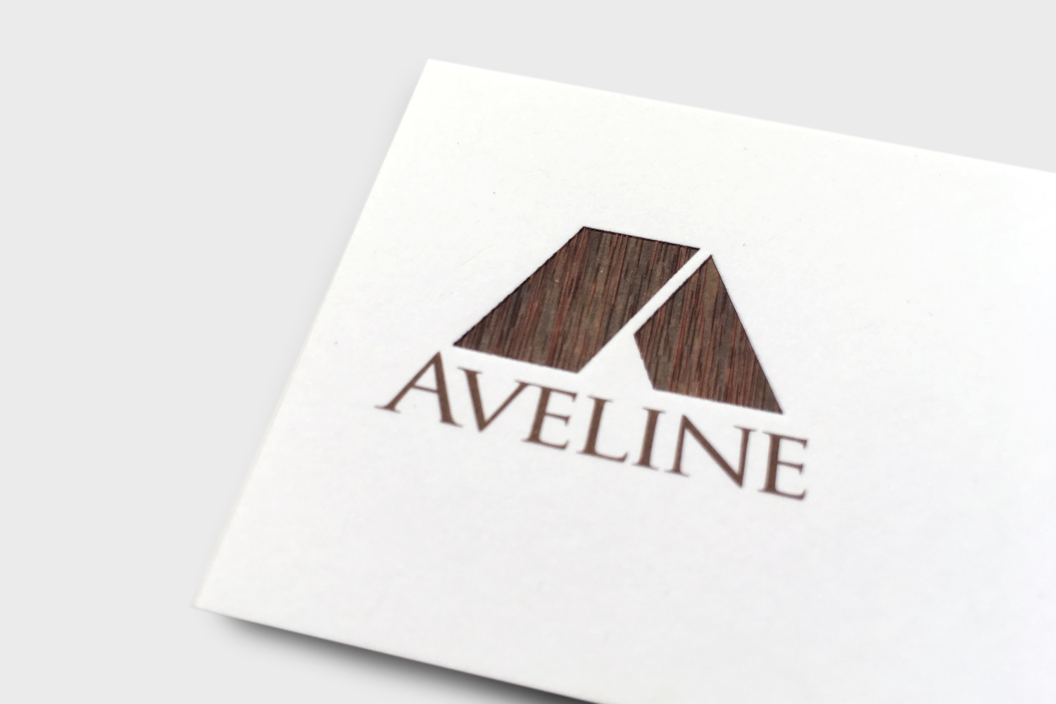
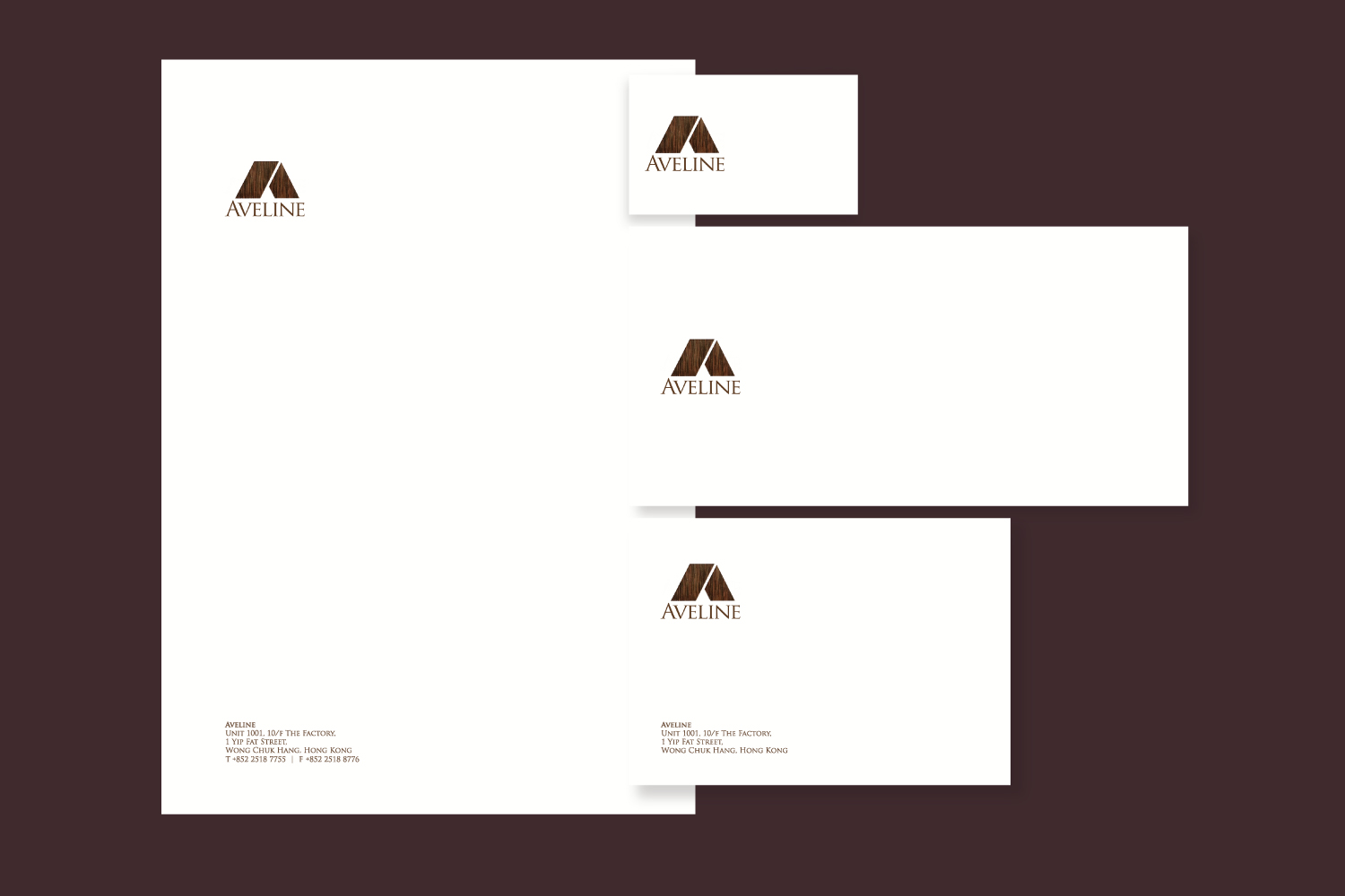
Aveline – a family private investment company. We use the letter A as a roof of a house and have the word Aveline underneath it – like the principle of the family business – everyone under one roof. The client likes the idea of wood on the logo as well. So, instead of using a wood image, we used a combination of colours and deboss on the logomark and created a very real effect of the wood texture. We created a set of stationery as well as the office signage for them.


