corporate identity, PRINT
arocrest
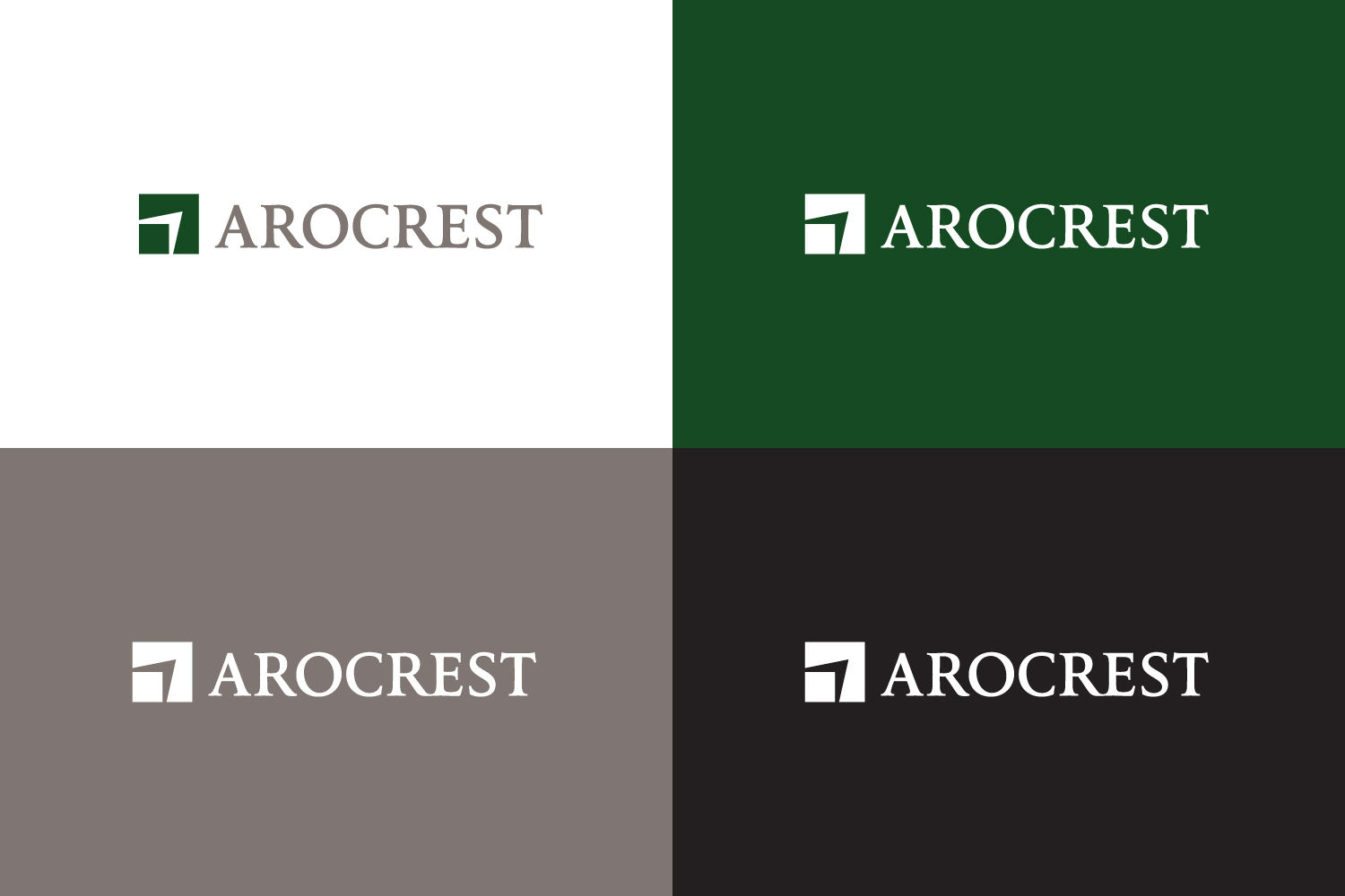
AroCrest is a private fund company which focuses on agriculture and land investment . The name which is made up of “ARO” which is Latin for cultivate or plow and sounds like “ARROW”, which for us means direction, focus, pinpoint and “CREST” is a reference to a wave, or market cycles and also reference to a ‘Family Crest”
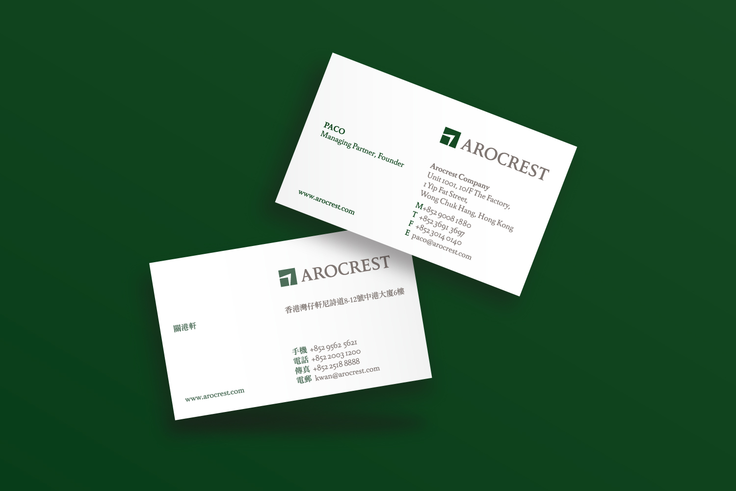
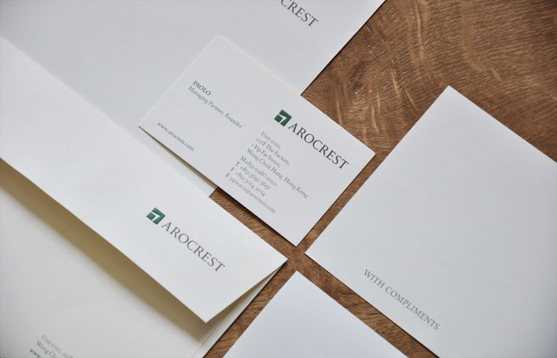
The client needed the brand AROCREST to look professional, strong and bold. Their corporate dark green colour reflects the kind of element they are invested upon – The logo on the stationery are also embossed to create a distinctive look. We also selected a grey as a supporting colour which compliments the dark green as well.
We selected images that also speaks what they do which they can use in their application and liven up their materials such as powerpoint and website for their potential clients.